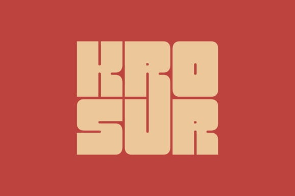
Krosur: A Confident Display Font for Modern Web Design
As a UI designer who ships dozens of landing pages, SaaS dashboards, and e-commerce experiences each year, I pay close attention to how type shapes perception before a single word is read. Krosur stands out—not because it shouts, but because it commands attention with clarity and warmth. It’s a display font built for digital environments where first impressions happen in under two seconds.
Krosur balances bold geometry with subtle humanist curves. Its letterforms are tightly spaced yet open, with generous x-heights and clean terminals that hold up beautifully on retina screens. Unlike many display fonts that sacrifice legibility for flair, Krosur maintains strong character distinction—even at smaller sizes—making it ideal for responsive headings, mobile navigation labels, and compact CTAs. It feels modern without leaning into cold minimalism, and confident without veering into aggression.
Where Krosur Earns Its Place in Your Layout
In practice, Krosur thrives where hierarchy and tone must align instantly. Use it for hero section headlines on product landing pages—its visual weight anchors the layout while its friendliness softens conversion friction. On boutique online stores, it elevates category banners and limited-edition announcements without overwhelming product imagery. For coaching or course websites, Krosur sets a tone of approachable authority in section headers like “How It Works” or “Join 2,400+ Learners.”
It’s especially effective on dark backgrounds: the contrast remains crisp, and its even stroke modulation prevents haloing. Over subtle image overlays, Krosur holds its shape without needing heavy text shadows—just solid color or light opacity adjustments. On mobile, I default to minimum 28px for H1s and 22px for H2s using Krosur; its open apertures and balanced proportions ensure quick scanning even on small viewports.
Readability, Rhythm, and Real-World Scanning Behavior
Web users don’t read—they scan. Krosur supports that behavior through deliberate design choices: uppercase-friendly letterforms, consistent baseline alignment, and generous inter-character spacing in webfont versions. That means your “Get Started Today” button doesn’t just look clickable—it feels decisive and trustworthy. On blog headers or newsletter teasers, Krosur creates instant visual separation from body copy, guiding the eye downward without competing for attention.
That said, Krosur isn’t meant for paragraphs. It’s a display font—best reserved for short, high-impact text: logos, section titles, feature highlights, testimonial quotes, and branded social media graphics. Its personality shines strongest when paired with a neutral, highly legible sans serif for body text—think Inter, Manrope, or even system fonts like -apple-system for performance-critical sites. For editorial or luxury brand sites, pairing Krosur with a refined serif (like Crimson Pro or IBM Plex Serif) adds depth while keeping hierarchy intact.
Brand Identity and Consistent Digital Tone
Your font choices silently communicate brand values. Krosur conveys confidence, clarity, and contemporary professionalism—ideal for creative agencies, fintech tools, wellness platforms, and independent makers building recognizable digital identities. Unlike script or handwritten fonts, it avoids trend fatigue; unlike ultra-thin or distressed display fonts, it scales reliably across devices and contexts.
I’ve used Krosur across portfolio sites where clients needed to project both expertise and empathy—say, a UX research consultancy or a sustainable fashion brand. In each case, the font reinforced voice without requiring explanation. It doesn’t distract; it affirms. That consistency matters when your audience encounters your brand across email headers, app launch screens, and Instagram story templates—all places where Krosur delivers cohesive recognition.
Technical Fit for Web Design Workflows
Krosur ships with multiple weights (Light, Regular, Bold), true italics, and OpenType features including stylistic alternates and ligatures—useful for logo lockups or custom headline treatments. It supports Latin-based languages and includes extended punctuation, making it viable for global-facing SaaS products and multilingual blogs. Webfont files are optimized for fast loading, and variable font options (where available) simplify CSS declarations and reduce HTTP requests.
When implementing, I always test fallback stacks: font-family: "Krosur", -apple-system, BlinkMacSystemFont, "Segoe UI", sans-serif;. This ensures graceful degradation without sacrificing hierarchy. For buttons and micro-interactions, I pair Krosur Bold with tight letter-spacing (0.5px) and subtle hover transforms—not animations that distract, but cues that confirm actionability.
Licensing for Real Projects
Krosur is a premium font—and worth the investment when brand integrity and performance matter. Its commercial license covers use on live websites, client projects, online stores, digital templates, and downloadable brand kits. Just verify that your license includes web embedding (WOFF2/WOFF), especially if you’re distributing themes or SaaS UI kits. Never self-host a font without explicit permission—even “free for personal use” licenses rarely cover production domains or client deliverables.
For designers building reusable components or design systems, Krosur integrates cleanly into Figma libraries and Storybook docs. Its predictable metrics and consistent spacing make it easy to establish typographic scale tokens—H1 at 48px/1.1, H2 at 36px/1.15, etc.—so developers implement with confidence.
If you’re choosing a display font not just for aesthetics but for how it guides attention, reinforces trust, and scales across touchpoints—Krosur earns its place in your core design toolkit. It doesn’t chase trends. It builds identity. And in today’s crowded digital landscape, that kind of quiet confidence is rare—and essential.