Froggo: A Display Font That Adds Magic to Digital Interfaces
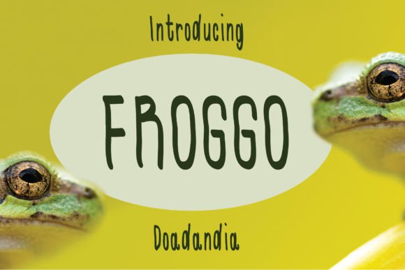
As a UI designer who ships landing pages, SaaS dashboards, and conversion-optimized storefronts, I reach for display fonts like Froggo when I need a visual spark that doesn’t sacrifice clarity or intention. It’s not just decorative—it’s functional typography with personality. Froggo lands somewhere between playful and polished: its slightly slim shard-like terminals catch light like gold foil, while soft, deliberate curves in each character give it warmth and motion—like ink drawn with gentle confidence.
This isn’t a font for body copy or data tables. Froggo is built for impact. Its rhythm works best at larger sizes—24px and up—and thrives where users pause, scan, and decide: hero headers, section titles, CTA buttons, banner ads, and digital product badges. On a coaching website’s headline—“Unlock Your Creative Flow”—Froggo adds levity without undermining authority. On a boutique online store’s limited-edition banner—“Golden Hour Drop Live”—it reinforces scarcity and premium feel through texture and tone.
Readability remains strong across devices because Froggo balances distinct letterforms with open counters and consistent x-height. On mobile, it holds up well in hero sections when paired with generous line-height (1.3–1.5) and sufficient contrast—especially against dark backgrounds. I’ve used it over deep navy gradients and muted cream overlays with no legibility drop, as long as the font weight is set to its primary bold or semi-bold variant (check your webfont package for available weights). Avoid ultra-thin or shadow-heavy treatments on small screens; Froggo’s charm lives in its clean, intentional shape—not in effects.
Visual hierarchy is where Froggo shines most. In a landing page layout, I’ll use it exclusively for H1s and primary CTAs, then pair it with a neutral sans serif—like Inter, Poppins, or Manrope—for all supporting text. That contrast creates instant structure: Froggo says “look here,” while the sans serif says “read this.” For editorial-style course pages or creative portfolios, I’ll sometimes layer it with a warm serif (e.g., Cormorant Garamond) for subheads—keeping Froggo reserved for the boldest moments only. Overuse dilutes its magic; restraint makes it memorable.
Froggo supports brand tone with surprising versatility. It reads as joyful but not childish—ideal for indie game studios, illustration blogs, or wellness brands that want approachability without sacrificing sophistication. I recently used it for a cartoon-themed language-learning app’s onboarding flow: the curved ‘g’ and tapered ‘r’ echoed the app’s friendly mascot, reinforcing voice across UI elements without needing custom iconography. It also performs well in SVG-based logo text for digital-first brands—just confirm your license includes logo usage before exporting.
For online stores, Froggo works especially well in flash banners, product spotlight cards, and seasonal campaign graphics. Its slight slimness gives it elegance next to hand-drawn illustrations or minimalist photography, while its gold-tinged perception subtly cues value and care. On Shopify or Webflow sites, I load it via @font-face with WOFF2 fallbacks and always declare font-display: swap to prevent invisible text during load. If your project requires multilingual support, verify whether the Froggo package includes extended Latin characters—or if diacritics render cleanly in your target languages (e.g., French, Spanish, Portuguese).
Practically speaking, Froggo is a premium font designed for digital environments—not print-first workflows. It ships in standard web-friendly formats (WOFF2, WOFF), often with stylistic alternates (like swash capitals or contextual ligatures) that add polish to hero text or branded social media graphics. But don’t assume those alternates are auto-enabled: you’ll need to activate them via font-feature-settings in CSS or through a design tool’s OpenType panel. And yes—this is a commercial font. Licensing matters: ensure your plan covers web embedding, client projects, SaaS platforms, and digital templates. Using Froggo in a Figma UI kit you sell? You’ll need an extended license. Embedding it on a client’s e-commerce site? Confirm domain-specific or unlimited-use terms apply.
I’ve seen Froggo elevate everything from Notion course dashboards to email header graphics—always when deployed with purpose. It’s not for every headline, but when your goal is to signal creativity, warmth, or lighthearted excellence, it delivers with quiet confidence. Try it for:
- A portfolio site’s “Work” section header—paired with tight spacing and ample whitespace
- A “Join the Waitlist” button on a product launch page—set in Froggo Bold, 20px, uppercase, with subtle letter-spacing
- Blog post featured graphics—used only in the title overlay, never in caption text
- Animated banner ads—where its curves translate smoothly into subtle CSS transforms
- Digital brand kits—reserved for logo lockups, cover slides, and social highlight reels
What sets Froggo apart from other display fonts isn’t just its aesthetic—it’s how it behaves in context. It doesn’t shout. It invites. It guides attention without overwhelming. In an interface crowded with generic sans serifs and overused scripts, Froggo offers distinction rooted in craft—not trend. That’s why it stays in my active font library, not my archive.
If you’re building something that needs to feel human, intentional, and digitally native—Froggo isn’t just a typeface choice. It’s a tone-setting decision. One that quietly tells users: this space was made with care.